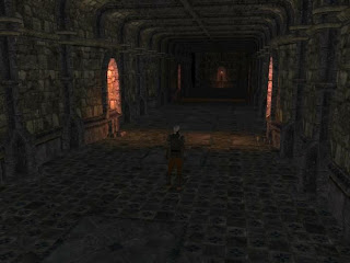
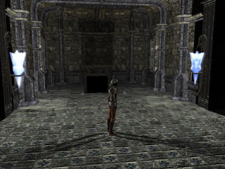
I started by making a passage for one of my locations and, almost straightaway, found that the walkmesh allowed a PC to walk through a wall if I used one of its variant designs. I tried all sorts to stop the PC from being able to walk through, and then after applying a bake for about a fifth time, the walls worked as they should! I have no idea why this should have happened, but I am glad it resolved itself.
Next, I set about trying to set some of the lighting for atmosphere. In the process, I wanted to make a prefab that allowed a light source to be attached to an existing prefab. This was not as intuitive as I thought it first would be. After grouping the objects together, I then exported the group, which saved in the prefab folder. However, to make the prefab available to use, I had to copy the exported file to my override folder and reload the module before I could access it. At one point, I tried to redo the prefab while the existing prefab was in my override folder, and this time the prefab appeared. Something strange is going on with these, and while I can get them to work ... eventually, I hope Obsidian intend to make these work a little more smoothly in the future.
Anyway, after messing around with some of the lighting options, I decided to allow the passage that I designed to appear more "accurate" according to available light sources than allow what I would call "studio lighting" (Directional Light) to be used. It does mean the passage appears darker than if I had used Directional Lighting, but I think the overall atmospheric effect is more desirable in the end result. I have included a couple of screen shots to show some of the lighting effects in place for this first interior design. One shows the darker basic torch lighting and the other, brighter magical lanterns:


No comments:
Post a Comment