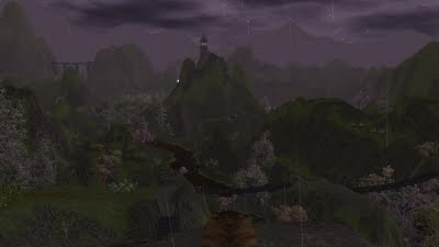
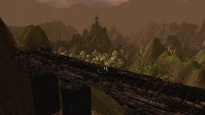
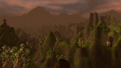
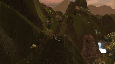
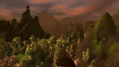
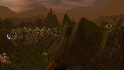
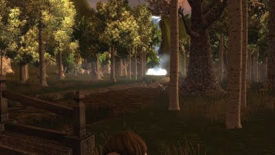
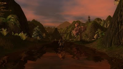
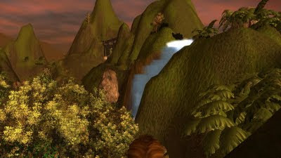
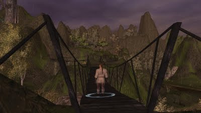
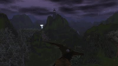
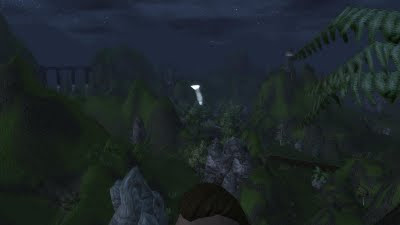
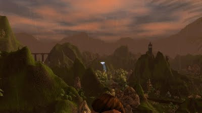
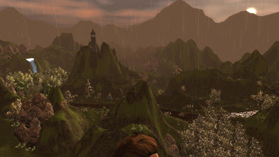
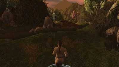
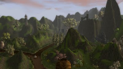
This week is going to be a short post by comparison, made up mostly of screenshots of an outside area I have tried making. As regular readers will know, area design is not one of my strong points, but having looked at other peoples work, I thought I would try again. The results were better than before, and so I decided I would be using them in the module. Check out the shots below and let me know what you think. One thing I learned from looking at other peoples work is that scale, when well used, can make an area feel bigger and fuller than it really is. (I don't normally like to give area screenshots as a preview, but I would like feedback in this case as well.)
Module One Increasing
One last note before the screenshots, and also on the subject of scale, I have decided to increase the number of areas of the first module. (The screenshots below are one of the areas.) The reason is due to the decision I made to release the first of the modules before the other two in the campaign. I felt that the first module lacked any real depth without the other two modules and would leave players a little disappointed. Thankfully, however, the new additions do not require much work, compared to the amount of game play they give in return. As much of the core code is already in place, I am simply expanding on the first module with a couple of slight detours.
Anyway, here are the screenshots of one of the areas (Enclave valley) that is nearly finished now, so please do leave a comment.
19 comments:
You're much better at these areas then you've let on! Nice job. Reminds of the karst hills around Guilin, China.
Thanks EC!
The improvements are only there since seeing others make areas and looking at other peoples work more closely. Hoegbo, in particular, helped demonstrate how to do things and I just did what I could. If you compare this to my first areas, it's about 20 times better!
At least I can try to do some areas now, without feeling too deflated at the results. :)
Lance.
These areas are nice. I really like the jagged elevation changes.
I would suggest a bit more blending of your textures or using the coloring tool to smooth your texture transitions. The base cliff and base grass tend to have a distinct line between them. I would suggest using the grass texture and run along the transition with 20-40% pressure & a modified medium brush, I like to add a couple of points to the outer radious and maybe decrease the inner radius. This will break up that line, the lower % grass texture on the cliff texture will also look like the grass is expanding or even give that mossy look.
I'll echo shaughn texture comments. The other thing that seemed unusual to me is the combination of jungle trees/plants with fall trees.
Hi Shaughn,
Points taken. I will look at adding some more grass then. I was a little worried about potential performance as this is a 32 x 32 area, which runs fine at the moment, but might slow down if I add too much.
Hi Kamal,
It was partly my concern about correct ecology that used to hinder me before. In the end I decided just to go with what "looked good" (to me at least) and not worry too much about plant types that may or may not work together. I decided it was just the "crazy" ecology of my fantasy world. ;)
Lance.
Nothing wrong with "it looks good" as a reason for a combination. Especially given magic, you can just point the finger and say "magic" if people complain.
I actually looked up the supposed climates of Faerun areas and tried to pick trees to match for my natural areas (olive trees in my city that is supposed to have a Greek influence for instance, it's very likely no one noticed since I never got any comments on it) for my campaign.
Of course anywhere that's high magic you can always just do whatever and say "magic", which I did as well.
Hi Kamal,
Yes, I like your work, "magic". As you say, it covers a number of differences. :) And as my world is generally "low magic" as far as items is concerned, then I guess restoring the balance with a magical environment seems fitting. :)
Lance.
Lance, just a clarification. In my post I was suggesting adding some more of the grass texture at a lower percentage on the transition point between the grass and cliff texture. The actual grass volume is fine.
I feel it's a bit cheeky of me to comment since I don't use the NWN2 toolset myself (although I did briefly when it came out), but since you asked, two things struck me from these pics, and one has already been addressed, being the non blending of the two textures on the mountains. It's been a long time since I opened it up, so I can't recall how easy/difficult it might be to adjust it. My initial thought would be to initiate a 3rd mid texture, so that the area could be painted in much the same style as I paint miniatures, ie light, medium, and dark tones.
The only other thing that jarred a little was the style of the peaks themselves, but judging from the comments you've had already that might just be down to personal taste. I just found them an odd mix of being too tall and pointy in comparison to their smoothness. Prefer a more jagged appearance.
Who knows? Maybe after I've got my long awaited NWN1 mod out the door I'll give the NWN2 toolset another look. ;)
Hi Shaughn,
Ah ... "texture" ... I see. OK. Funny enough, one of the reasons I had not done as much of this already was because when I looked at some pictures of a real environment I was trying to emulate, there was a definite rock end and grass start line. Maybe, a mixture of both is required?
Hi Quillmaster,
You really ought to come aboard the NWN2 train you know! ;) See my response to Shaugh above about the texture thing. As for the jaggy and smooth difference, I know what you mean. However, having looked at screenshots of how some of the pro's do it (DDO), my own designs were not too disimilar. I am not saying it's correct, but maybe just more practical ... and it's due to magic of course! ;)
Lance.
Haha! Good ol' magic! You can't beat it ;)
One quick way to blend textures is to do a small brush at 67% at the texture border, and then another at 33% around that.
Another way to do it is to set your brush size to 0 inner, 6 outer. This creates a nice smooth transition.
Hi Kamal,
Thanks for the tip!
Lance.
Now that I am only working 40 hours a week with no school, I'm bag in the modding scene. I'll be checking your posts I may have missed so mind any old comments.
I've also posted about my new episode-module due out in june if you want to check my blog.
As for this post, it all looks good, but dont forget to control the direction of the water in a river (to show flowing water). Not that you did or didn't, can't tell in the shots.
I like it a lot so far, did you learn anything from my areas? Will any be in chapter 1?
Oh as for improvements, I notice your water edges are a little choppy. They aren't triangular (like mine always were before I realized less than size 6 circles are too low poly to resolve, thankfully just as I made that exterior for you) but they do kind of look like repeated circle halves.
To smooth out the difference, I refer you to my smooth tip I gave you a while back that was passed to me on my blog. Smooth brush 15%: inner-0 outer-6 (or larger) click to dispose of unsightly edges.
ps 32x32 areas should never be used. The toolset cant handle them and neither can the game. It crash ridiculously as you add content and low end users might not even be able to play. The toolset problems aren't system related; the engine can't handle it's own limits even on my super spec deskktop.
Had to add this when I read about 32x32 area size: Pretty much the agreement among journeyman area builders is you don't max the area size ever. 24x24 is as big as I will go (or 28x20).
You may want to terra coppa or whatever its called on this area.
Hi Eguintir,
I look forward to hearing any comments you have for any posts made in the past. I will look out for them and respond to any made. I will continue to check out your blog as usual. :)
I did try to control the water flow and speed as it moved away from the waterfall. It looks reasonable to me, but may not be as good as some could do.
This new area is for module 1, as I wanted a large exploration area for players to wonder around. It's needed really.
I will try that smoothing trick you suggest. I must have struggled with the water edge for quite some time though and it started to get tedious. ;)
Although this area is 32 x 32, I am not having any trouble with it at all. (?) I even test it with the toolset open at the same time as the game is being tested! And it still runs fine.
Maybe I could erf the area for you to download and test out / check? See if there is a difference for you? Let me know and I will upload it somewhere for you to download (or anybody else who may be interested).
Lance.
u can. u can also send it to me for water edge smoothing if you so desire
Hi E.E.
I will send you a personal email with a DL link. I have already done the water smoothing as per your instructions. The main thing is to let me know how it performs on your computer setup, as I am not having any issues that I am aware of.
Lance.
Ah, very nice use of verticality indeed :) glad to see some variation in NWN 2 indeed.
Also it's good to be back.
Mazena
Post a Comment